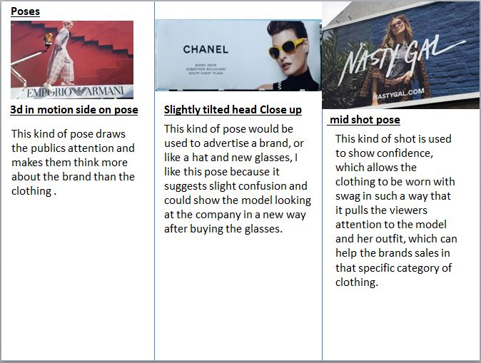
1.1: Advertising by sector
1.2: Target audiences of advertisements
1.4: Advertising codes and conventions
1.5: Advertisement types and persuasive techniques
Textual Analyses
1.6: Fashion Advertising
1.7:Source Audience Information
1.8-9:Preparation Of Text Materials and Source Interactive Material
1.10:Preparation Of Visual Materials
Billboard
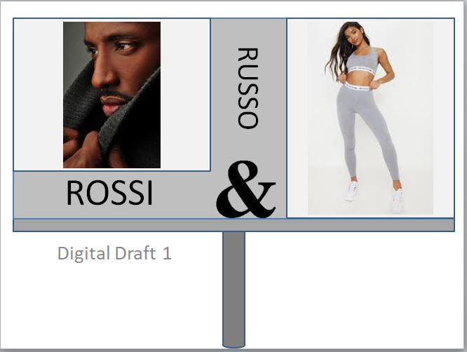
Digital draft for my billboard
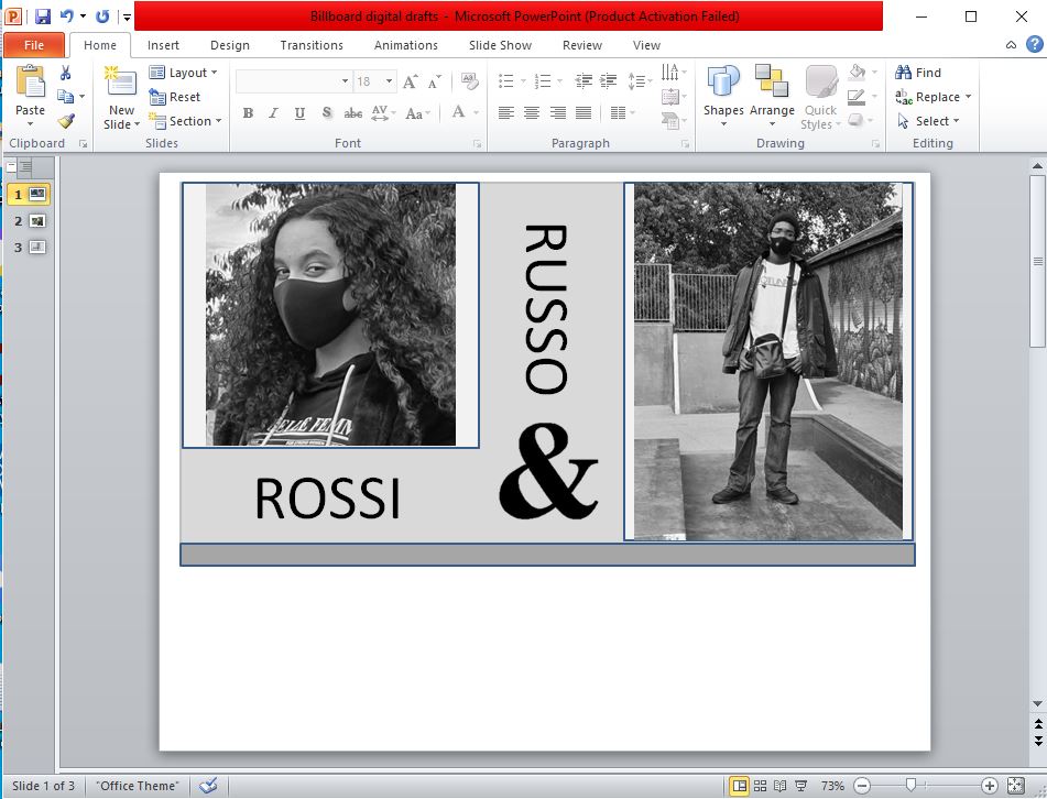
During this time, I chose to take out the pole from the billboard as that restricts the amount of space I can use for it and I made this choice so that I could make the billboard bigger without having to worry about the pole fitting into the picture. I added blue outlines to some parts of the billboard as I thought it would look good, but soon after I realised that it doesn’t look as nice as I thought it would, as it separates all the elements from each other which makes my billboard loose its cohesion.
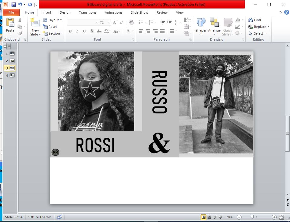
In this session I changed the entire size of the billboard and the positioning of the text, I made these changes because, I felt like the size of the billboard was too small which made me adjust the image sizes and move around the text to find good positioning and I think that the changes I made to the billboard size and text positioning makes my billboard look more put together. I changed the colours of the outlines, to the colour that is next to the outline so that everything in the background look seamlessly connected. I changed the font from Calibri (Body) to Bahnschrift Condensed, because it looks bolder and reminds me of the font used for the Hugo Boss, which I really like. I also added two logos to the billboard I put one in the bottom left corner which is meant to be like a company stamp in the corner of the billboard that lets the viewer know that its authentic, but I don’t know it I want to keep it as it looks out of place which, can draw attention to it instead of the face mask designs.
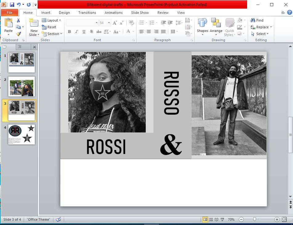
This is my final product I think that it looks really good with the black and white aesthetic, I didn’t make many changes to it since my last log, and I have only removed the logo in the corner, this is because I felt like it was drawing attention away from the face masks and the models in the pictures. I also changed the design on the star logo from two custom R’s back to back to two R’s in the same font as the brand name text, when I added the custom letter R I wasn’t sure that it had any copyright problems so to be safe I changed it to the same font as the other text.
Final Evaluation
For my final product, I used common camera angles that I had seen in other billboards. so I chose to use a close up from a side on angle for the first picture and I used a long shot for the second one, when it comes to lighting I used natural lighting, then grey-scaled the pictures because that was the colour scheme I chose, as it makes my billboard seem quite distinguished and it can make people who see it think its high quality clothing. For my pictures I chose to get models within the target audience, I think this was a smart choice as it can create a genuine connection with the viewer of the billboard as they could relate to the billboard, and within that target audience there are a lot of trend setters and influencers so if the face masks becomes popular the sale within the target audience will sky rocket. I think that this billboard would be promoted in and around central London and it could even be shown online on like Instagram. The only risks I can see with audience consumption would be if people start copying the design and selling for different prices or people could write bad reviews on the product which could drop sales.
