|
For overview on the whole unit click this link:
|
https://prezi.com/view/dxsWvhbkGTlyJnv3mgHN/
|
Genre
|
Genre definition
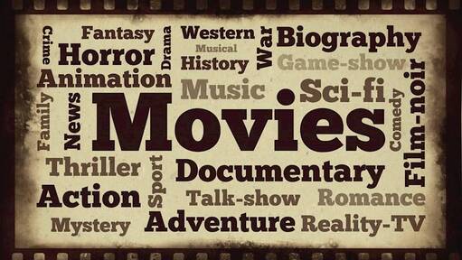
A genre is a style or type of things like films, music, television programmes or art. Here are some examples of different genres: Music: Pop, rap, country, soul, jazz, blues, rock, R’n’B etc. Movies & TV: Action, romance, comedy, horror, thriller, sci-fi etc. Art: Architecture, Sculpture, Painting etc. |
|
Magazine
|
Magazine Definiton
A publication containing articles and illustrations, often on a particular subject or aimed at a particular readership. |
|
|
Differences between PRINT & DIGITAL magazines.
A PRINT magazine is the physical copy of a magazine that can be purchased in the local newsagents or supermarkets whereas DIGITAL magazines are downloaded onto your devices whether it’s a phone or a tablet or can be view from the internet. DIGITAL magazines have social engagement (reader to reader) and videos but Print magazines do not have as much social engagement as DIGITAL and has no videos on it. |
|
Different categories of magazine
|
Entertainment e.g. Movies &TV
In these magazines i have above they are catered more towards superhero lovers, comic book readers and action fans. The target audience would be men and women from the ages of 12 - 50 i say this because at the age of 12 you are allowed to go and watch these kind of films by yourself and i don't really see any adults over 50 watch them either. this kind of magazine is made to inform the reader about the film but also hype up the film so it gets more viewers at the box office. |
|
|
Food
Target audience people who like food, chefs/cooks and food connoisseurs I don’t think that there is is a target age demographic, but these kind of magazines are more catered to people who want to try new recipes or people who are trying to start a cooking business i would say that this magazine category is made to promote and inform. this would most likely be a globally accepted magazine as chefs need to learn all kinds of cooking skills. |
|
|
Fashion
Target audience (15-40), this magazine is directed at women are big spenders, but can be useful to both genders if a guy or girl wants a future fashion designers and event planners. This is mainly meant to increase sales of clothes or debut a celeb in the dress. but this would only be useful to the people that read the language and r from the same country as the dress company. |
|
|
Sports
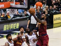
the target demographic for this would be youths around the age of 12 - 18 as they would be looking to see role models for them or to understand how hard a certain player like Charles Barkley had to work to get into the NBA. The geographic of this would depend on the sports system in the country and if the country does the sport. This form of magazine i would say is made to entertain and promote, with a journalistic and competitive content style. |
|
|
Gamer
The target demographic for this would be anyone over the age of 10 as the gaming community has you playing games from young and the kind of games on here would need an older age so 10 and up is the best target audience. this magazine informs players on the games shown and new strategies to play the games or if there are any new games coming out this magazine can be world wide because the games here are played globally. The aim of the genre of magazine is to entertain, inform and promote the games and consoles shown, |
|
Different areas of marketing
What is a Demographic?
A demographic is the different audiences you are catering to whether its different age demographics, gender, income, ethnic, education attainment or geographic area.
A demographic is the different audiences you are catering to whether its different age demographics, gender, income, ethnic, education attainment or geographic area.
what is a Psychographic?
Psychographics is a qualitative methodology used to describe consumers individual traits like if they enjoy comic books, movies or tech.
Psychographics is a qualitative methodology used to describe consumers individual traits like if they enjoy comic books, movies or tech.
what is a Geographic?
A geographic is the place or region that the target audience are from.
A geographic is the place or region that the target audience are from.
Conventions
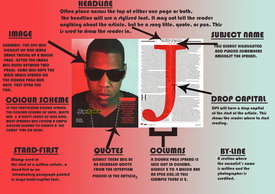
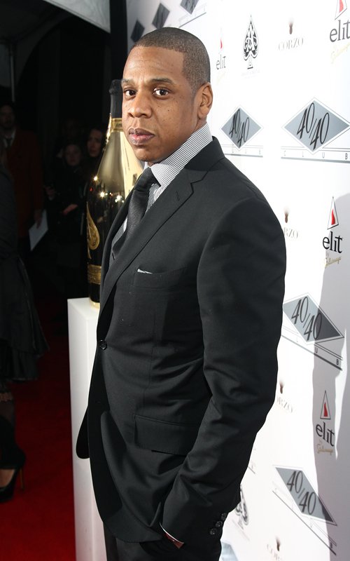
Front Cover-Busta Rhyme
Double Spread-Jay-z
Magazine Analysis |
Front Covers |
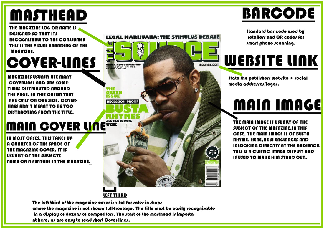
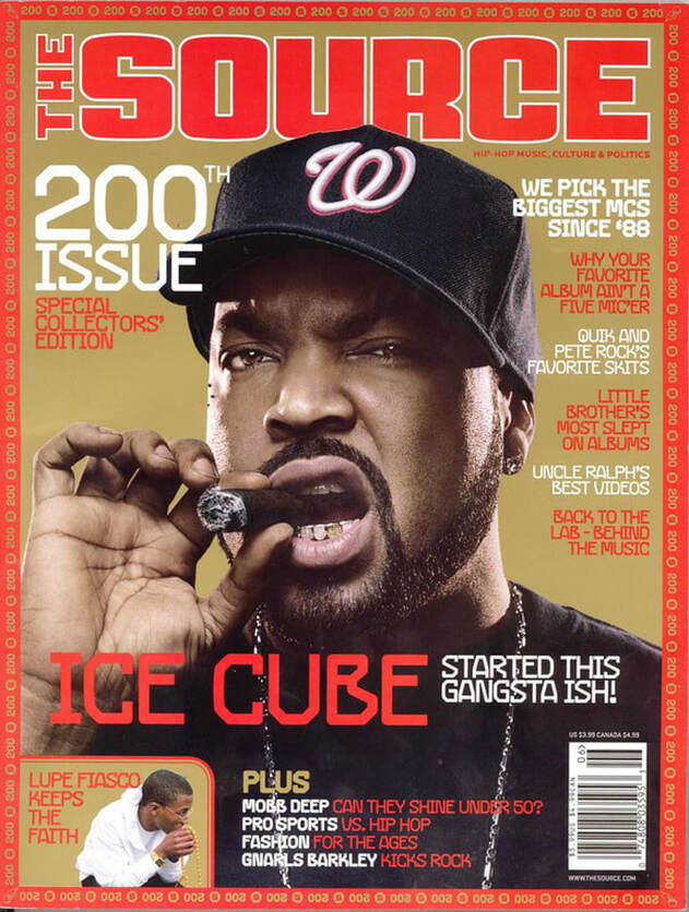
Ice Cube Magazine AnalysisDenotation:
The magazine cover consists of a colour photograph of Ice Cube looking directly at the camera. Its is a medium close up showing his head and reaching his shoulders. Since it is a medium close up I assume he is standing up when posing. The background of the photograph is gold which fit really well as the page borders are red, the photo covers a majority of the page there is a small section that seems to be dedicated to Lupe Fiasco. Above Ice Cube’s head is the “The Source” masthead, in front of him are four separate cover-lines in red and white. The name of the artist is below his chin and in red. Between each cover-line there is a gap to show that they are different cover-lines. The barcode it visible in the bottom right corner. Mise-En-Scene: The cover photograph is of a famous rapper ‘Ice Cube’ who was in a gang called NWA “Niggas with Attitude”. He is posed in a very ‘I don’t care’ or ‘I do what I want’ kind of way. From what I can see he is wearing a black shirt, a gold chain, eye rings, baseball cap and a cigar. This costume seems to be quite humble but at the same time still boasting about wealth to some degree. The clothes he is wearing is similar to what he would wear in either his songs or films he has stared or appeared in. His Non-Verbal Communication is very in your face and that he doesn’t care what people think, his mouth is open as he is biting down on the cigar kind of giving off a dangerous vibe. Lighting is a mixture of mid-key and natural lighting to give him a very real look most likely because of his background and to adhere to his wealth. The setting is just a gold back drop which connotes wealth goodness and purity (to some degree). |
|
Typography:
The source’s masthead is bold and sharp but curved and has a 2d design: red text with a white outline. The font is in sans-serif. The font used is quite common in the hip-hop/R’n’B genre’s as it can connote rebellion, modernity, and American culture. In a lot of his music he talks about problems that were bad at the time and that weren’t getting the attention it needs, so the magazine ‘The Source’ is fitting as this could connote to this magazine being the source of truth or news on issues in today’s society. The main cover-line relates to the picture as Ice Cube States that he “started this gangsta ish”, this pays into the impression of not caring and rebellion. The cover-lines tell us that the magazine has only been using the best of the best rappers since 1988, this suggests that this is a magazine for the best kinds of rapper and that it must be hard to get on it. The cover-lines also mention other artists and other areas of American culture like Mobb Deep, Pro Sports, Fashion, Gnarls Barkley and even has a small section in the left hand corner dedicated to Lupe Fiasco.
Target Audience
considering all of these points, the likely target audience would be (male and female, though more male audience members than female), I would say between the ages of 18 -36 mainly because the focused artist made music mostly for that kind of age group, and because they can relate better to the situation than anyone older but younger kids maybe able to relate to this.
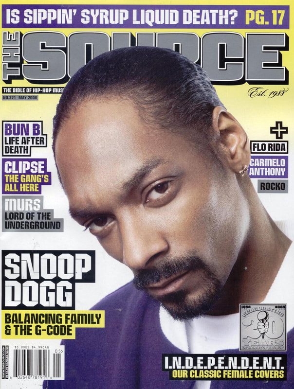
Snoop Dogg Magazine Analysis
|
Denotation
The magazine consists of a colour photograph of a man looking directly at the camera. It is a medium close up showing his head, neck and shoulder. Since we can’t see his whole body I assume that he is standing up. The background starts off as a bright yellow then the gradient and turns white. Behind the top of his head is the mast head ‘the source’, beside him are four cover-lines in black, grey, white, purple and yellow. The man’s name is in white beside his face and has a custom font. The barcode is visible for the bottom left corner. Mise-En-Scene The cover photograph is of a famous successful rapper ’Snoop Dogg’. He has a quite serious expression on his face. His NVC tells you that he isn’t someone that you can mess with. It looks like he is wearing a purple cardigan and a white t-shirt underneath it. The lighting used is high-key lighting, as the photograph is reflecting the bright colours in the background. The setting is mostly relevant but white and gold can connote wealth purity which plays into the colour purple even though its not apart of the background there is a lot of it on screen and the purple connotes royalty which relates to his high status as a rapper. |
Typography
‘The source’ mast head isn’t as distinctive as others: Grey with a white outline and black drop shadow. The font used is sans-serif, the font itself changes between the different cover-lines as it moves between a regular sans serif one to a stencil or stencil STD looking one. On one of the cover lines is mentions balancing family and the G-Code which is a reference to his song with Dr. Dre called “Nuthin’ But A ‘G’ Code” which was made to rival the Ghetto Boyz song G-Code. The different cover-lines tell us that this magazine is quite diverse with the different genres that it chooses to write about, it even shows challenging journalism as they talk about women’s independence day (or anniversary). This magazine also mentions some other artists like flo rida, Bun B, Carmelo Anthony, Rocko and Murs.
Target Audience
Considering all of these points, the likely target audience would be people (male and female I don’t think its reared more toward male or female its equal) aged 16-40. This would be good for teenagers as they would learn about amazing artists and the older generation would have good knowledge of the artist already.
Double Spreads
Drake Double Spread Analysis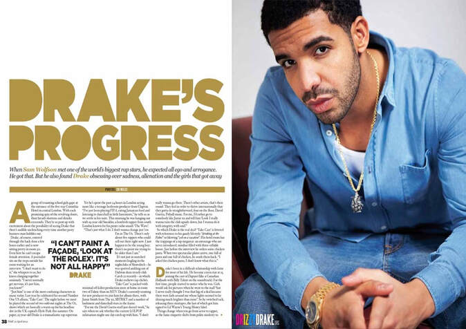
|
Denotation
This double spread consists of a colour photograph of a man and a panel to the left talking about his progress in his career. It is a medium long shot showing his head, arms and waist. He is sitting on what looks like a couch in an interested manner, his knees are visible in the in the shot. The background of the shot in plain but show a white wall and like a red or maroon couch. Next to the picture is the Headline where the subject name is included, there is also three columns two drop capitals and a quote from the subject himself in the middle. There is also a by-line which gives you a short insight to drake’s personality and what he struggles with. The main colour in this are blue, gold, white and black. Mise-En-Scene Half of the double spread has a photograph of the artist who is posed in a way that can come across as interested or if he was about to tell you a lot about him. His NVC lets you know that he is interested in the interview and is ready to talk about his life experiences and more. He is wearing denim jeans, a white vest and a denim shirt. He is also wearing a gold chain and a gold watch these are either a part of his costume or props. The lighting used is high–key lighting. |
Typography
The Head line is very distinctive: flat gold colour. The font used is a serif font. The words Drake’s Progress suggests that he has been through something serious and the interview was made to address the situation. The first paragraph of the first column and the last paragraph in the third column have drop capitals. Within the middle of the text there is a quote from drake himself. Drake’s name occurs multiple time throughout the text. There is a short by-line where it mentions how the writer was able to have the chance to talk to Drake.
Target audience
Considering all of these points, the likely target audience would be people (both male and female) aged 15-48. They would have good knowledge of Drake’s work and would have an interest in his life.
|
Denotation
The double spread consists of a classy photograph of Rick Ross and an interview on how he rose to fame. This is a long shot as you can see him from head to toe. The background of the photograph is white. There are no cover-lines. Rick Ross’ name is bold in black so you are drawn to his name when you look at it. Mise-en-Scene The main image is of a successful American rapper Rick Ross. His NVC I quite hard to tell as his eyes are blocked by the glasses, but other than that he looks as if he sees himself as higher than everyone else. He is wearing a black suit with a white shirt and black ascot with a white handkerchief. He also has a ring and a watch. The props that he is using are a Champaign bottle, a glass and a lot of balloons behind him. The lighting used is high-key lighting. |
Rick Ross Double Spread Analysis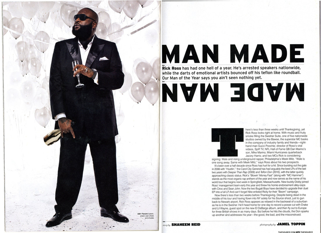
|
Typography
The head-line is very distinctive as it is reflected beneath the stand-first. The font used is sans-serif. The word man made suggests that he made himself successful and is proud of the fact that he did. There is a drop capital that is larger than all the other ones that I have written about. There seems to be no quotes on this double spread. There are no columns the paragraph is formal normally. The colour scheme is white and black. His interview sounds like his is very proud with himself and he gives of a playboy can’t care less vibe.
Target Audience
Considering all of these points, the likely target audience would be people aged 17-50 as any one below may not know of him but this seems to be more targeted towards the people who know of him and his work.
Digital Vs. Print
DigitalPros
Cons
|
Pros
Cons
|
Conclusion
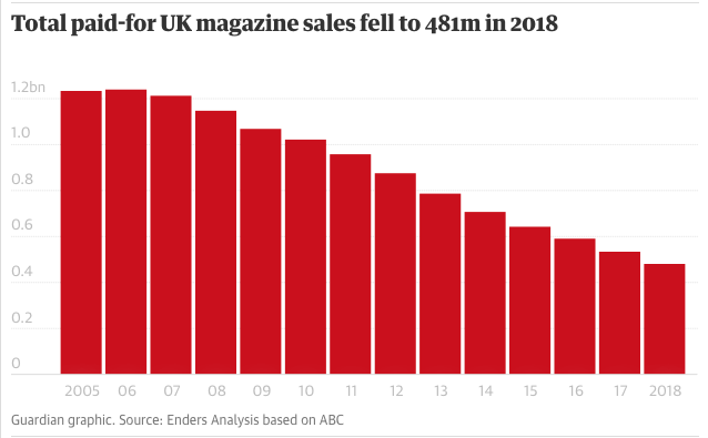
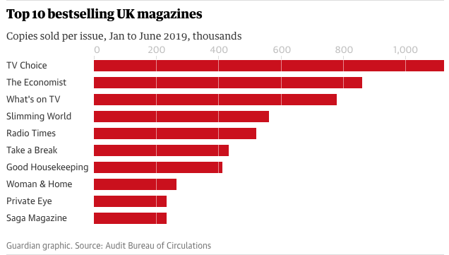
From this analysis on the pros and cons for both print and digital magazines/newspapers you can see that both of them both have the same number of pros but digital magazines have more cons and these cons are mainly associated with internet issues such as download speed, internet connection and outdated software which are not hard fixes, so print seems to have a more prominent problems like not being able to reach their target audience as people don’t normally stop to get magazines whereas having it online like digital is better because you have an endless resource to make sure that your magazine reaches all people, print magazines don’t make as much money as subscriptions because you have to go out and buy them whereas subscriptions come either to you door or you phone. In conclusion I think that print magazines have become outdated and digital magazines are the best way for these companies to reach their target audience and is more accessible for those who can’t go out and get it. Companies like Marie Claire, FHM, More! & just last year NME stopped printing after 66 years. In 2018 magazine sales fell to £481 million from £1.2 billion below you will see a bar chart with these stats and anther with the stats for the bestselling magazines in the UK.
From this analysis on the pros and cons for both print and digital magazines/newspapers you can see that both of them both have the same number of pros but digital magazines have more cons and these cons are mainly associated with internet issues such as download speed, internet connection and outdated software which are not hard fixes, so print seems to have a more prominent problems like not being able to reach their target audience as people don’t normally stop to get magazines whereas having it online like digital is better because you have an endless resource to make sure that your magazine reaches all people, print magazines don’t make as much money as subscriptions because you have to go out and buy them whereas subscriptions come either to you door or you phone. In conclusion I think that print magazines have become outdated and digital magazines are the best way for these companies to reach their target audience and is more accessible for those who can’t go out and get it. Companies like Marie Claire, FHM, More! & just last year NME stopped printing after 66 years. In 2018 magazine sales fell to £481 million from £1.2 billion below you will see a bar chart with these stats and anther with the stats for the bestselling magazines in the UK.
|
|
R'n'B
R’n’B The "Rhythm & Blues" term was created to replace the designation "race music," which until then was the standard catch-all phrase used in reference to most music made by blacks at the time. After the "race music" term was deemed offensive, Billboard began using the Rhythm & Blues name that Wexler created. R’n’B is a genre of popular music that originated in African American communities in the 1940s. I was made from other popular music forms like Jazz & Blues which are still very prominent in today’s society. Since r’n’b derives from blues and jazz lets take a quick look at these two
Blue: Blues is a music genre and musical form which was originated in the Deep South of the United States around the 1870s by African-Americans from roots in African musical traditions, African-American work songs, and spirituals. ... Blues as a genre is also characterised by its lyrics, bass lines, and instrumentation.
Jazz: American music developed especially from ragtime and blues and characterised by propulsive syncopated rhythms, polyphonic ensemble playing, varying degrees of improvisation, and often deliberate distortions of pitch and timbre. b : popular dance music influenced by jazz and played in a loud rhythmic manner.
Greatest Albums and icons & stylings used by them
|
•Some of the best R’n’B albums in my opinion are the miseducation of Lauren Hill, 11 by Boyz 11 Men and Confessions by Usher in 2004.
•The albums above are from some of the best R'n'B musicians like Lauren Hill, Chris Brown, Boyz 11 Men, Usher and Beyoncé. •A common style of R’n’B is contemporary R’n’B. which is the many R’n’B artists use. •What I have notices is that for a lot of these R’n’B artists is that often their clothes that they wear sometimes reflects who they are, so you can’t really find any similarities in the clothes they wear. 
|
|
|
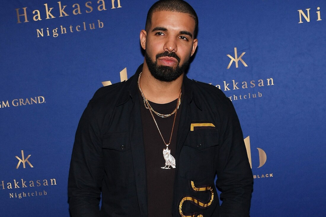
Top 5
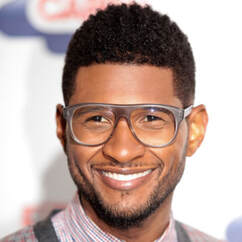
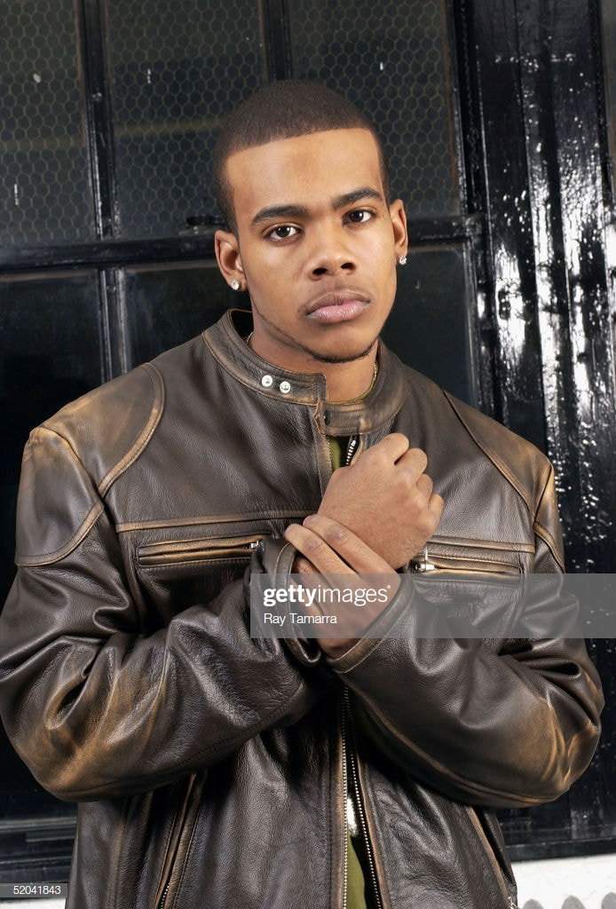
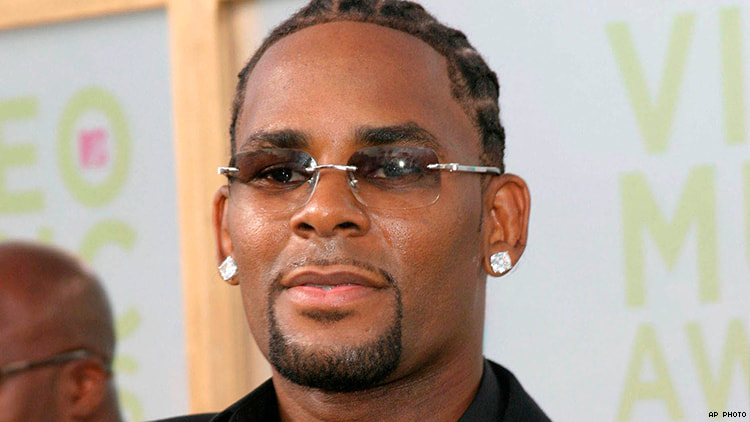
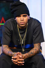
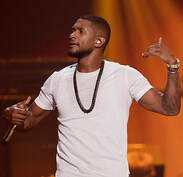
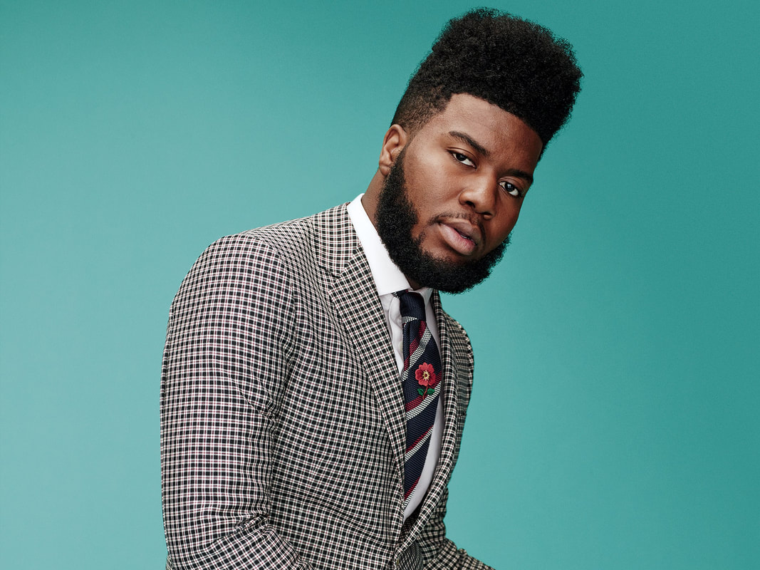
Facial Hair

|

|
|
|
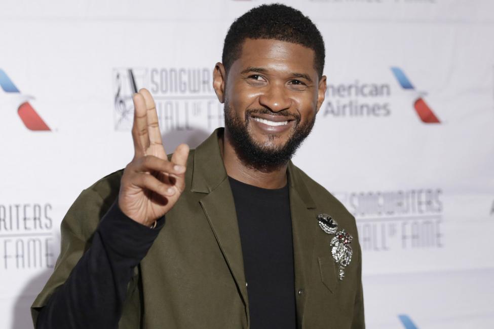
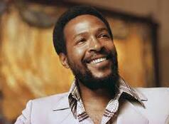
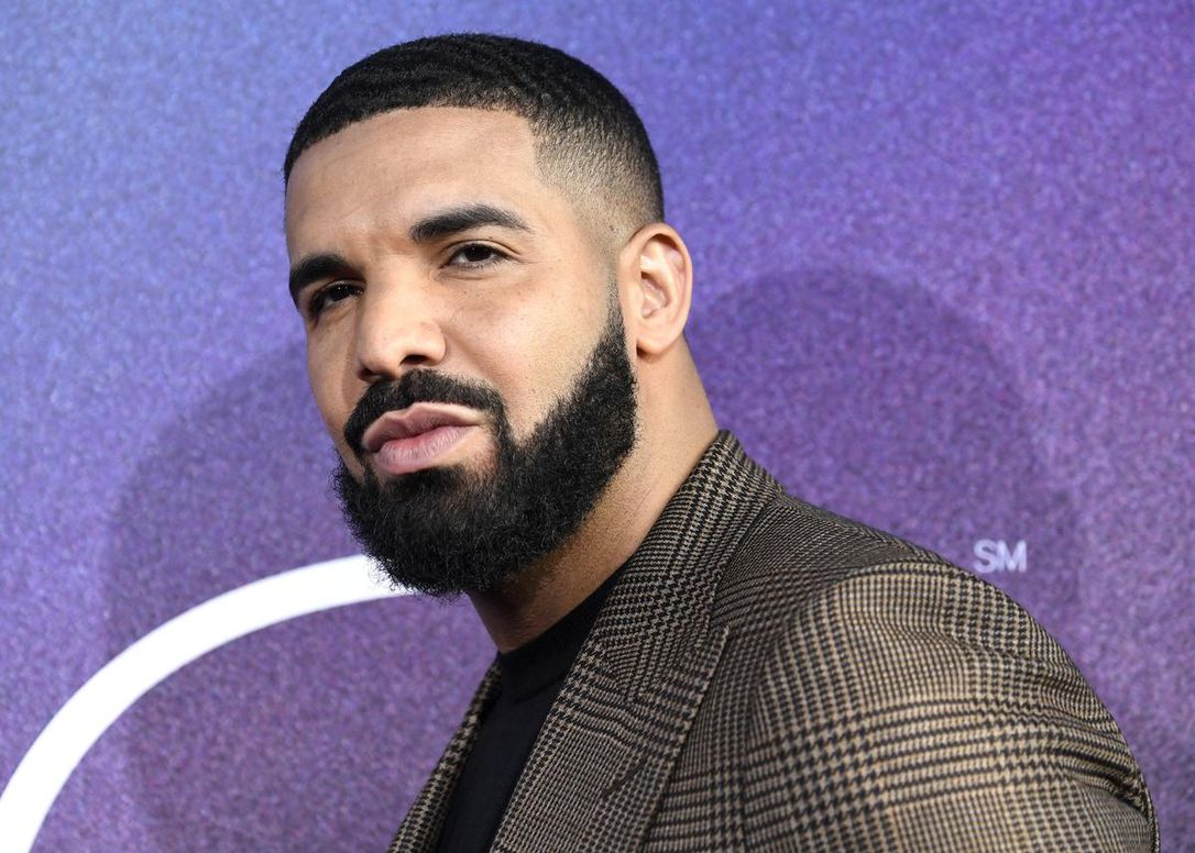
As you can see from the four pictures above i would say that a common fashion style in R'n'B for men are full beards that connect to their beard and are kept well groomed, i feel like it creates a sense of smart wear.
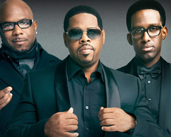
Side On Shot
|
|
|
|
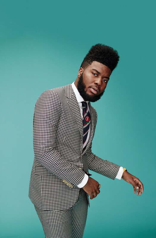
Above this text there are four pictures of a common pose seen in the men of R'n'B. the side on shot which makes then come across as sophisticated and stylish at the same time.
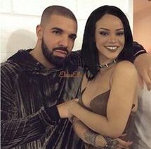
The Cute Couple Shot
|
|
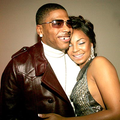
|
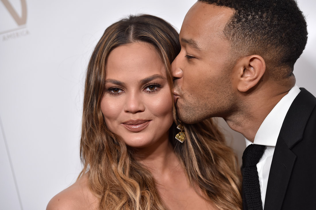
|
These pictures are of R'n'B artists that are in a couple or were before. these pictures are quite common and are mean to be relatable and cute to make everyones favourite artists look more normal and happy.
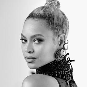
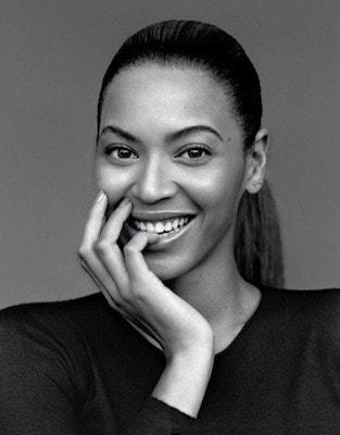
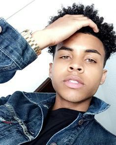
Big / Long Curly Hair
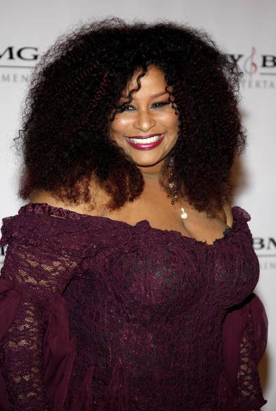
|
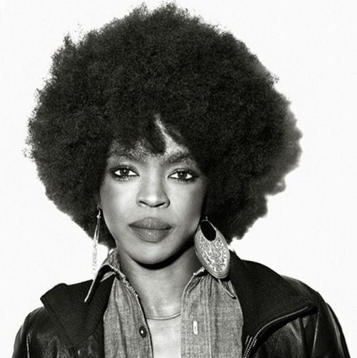
|
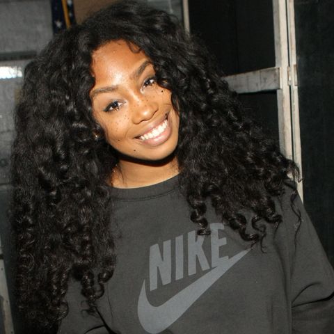
|
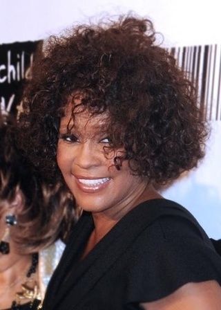
|
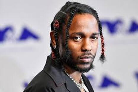
Big or long curly hair seems to be very common in the sub genre of R'n'B. As these four women use the same hair styles and three of them are highly influential artists and one is up and coming, the hair style seems to show respect or pay homage to their ancestry.
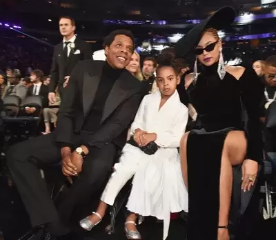
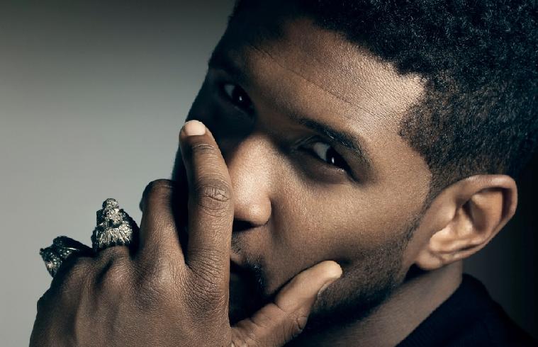
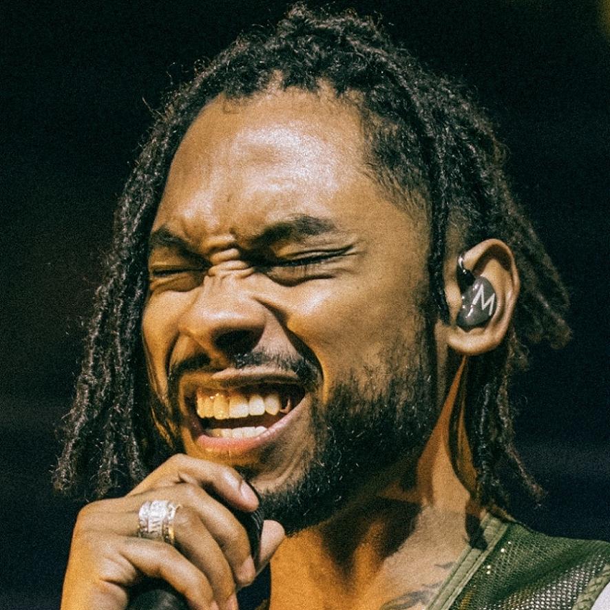
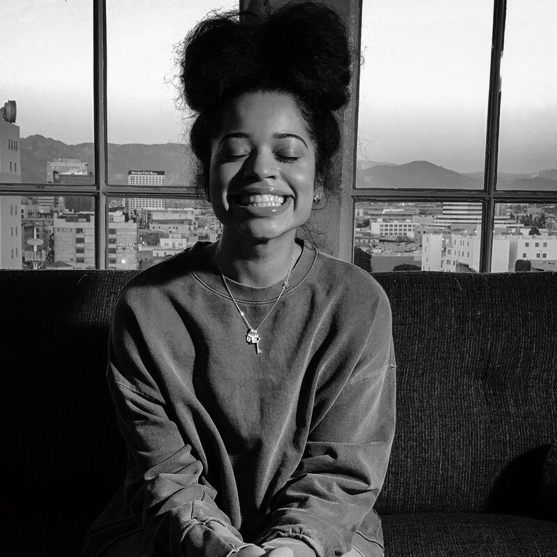
Hand Poses
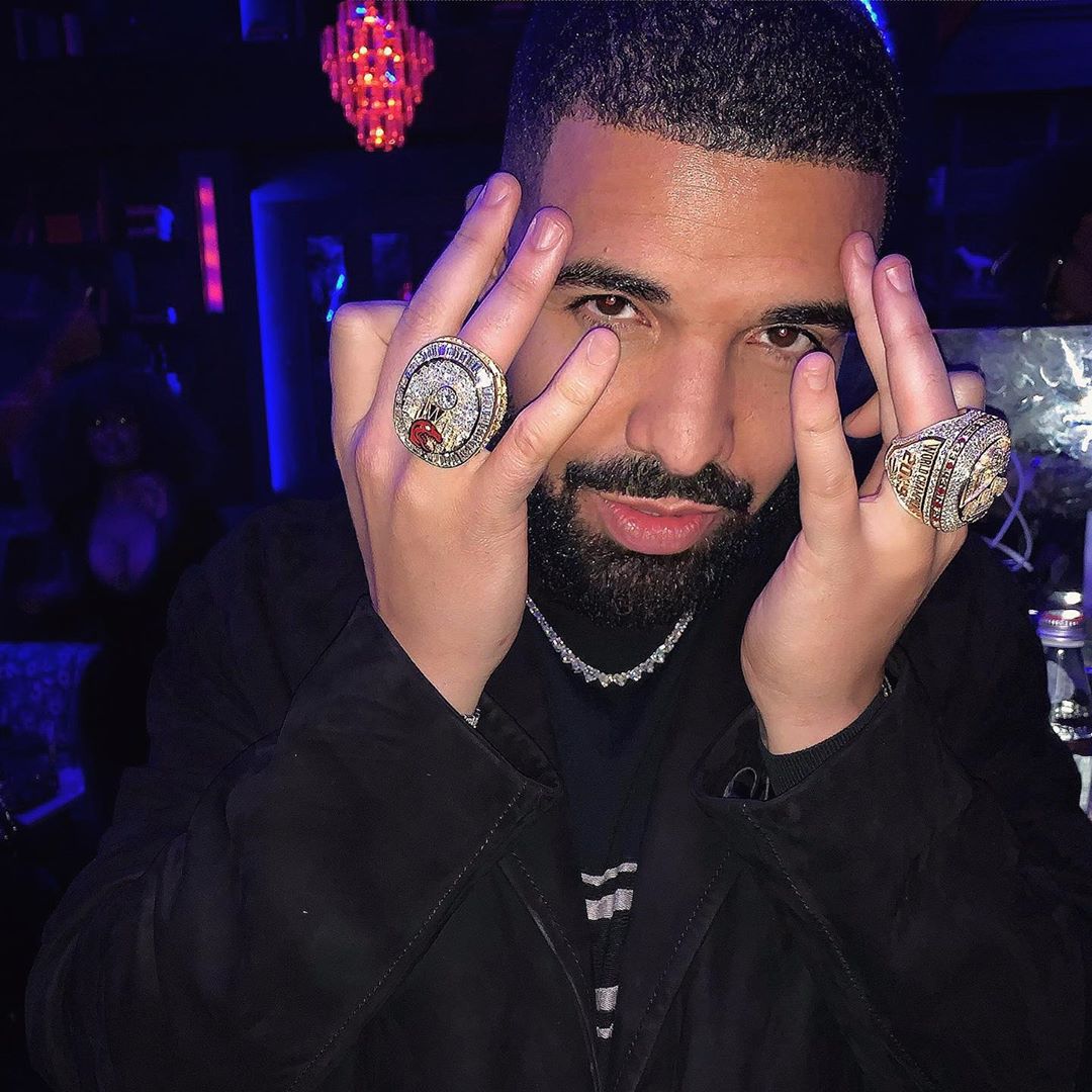
|
|
|
|
These different hand poses are more or less the same thing but to me it seems as tho each one is either just a pose from different times or to state different levels of like clout.
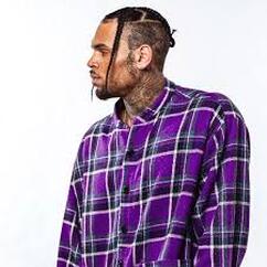
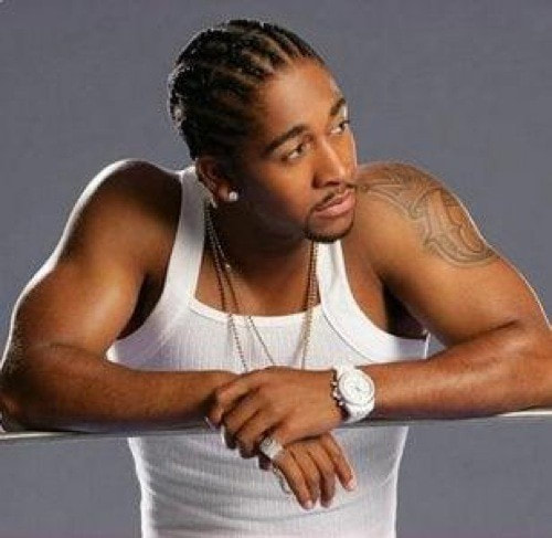
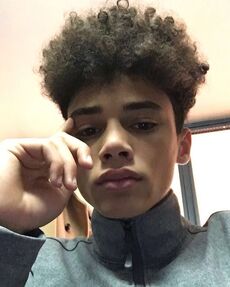
Braids/dreads/twist
|
|
|
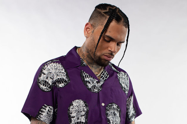
|
this hair style is a fashion trend and is used by both men and women. as time has gone on, however their have been different iterations of these hair styles one of which is demonstrated by Chris brown.
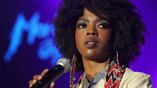
Black & White Shot
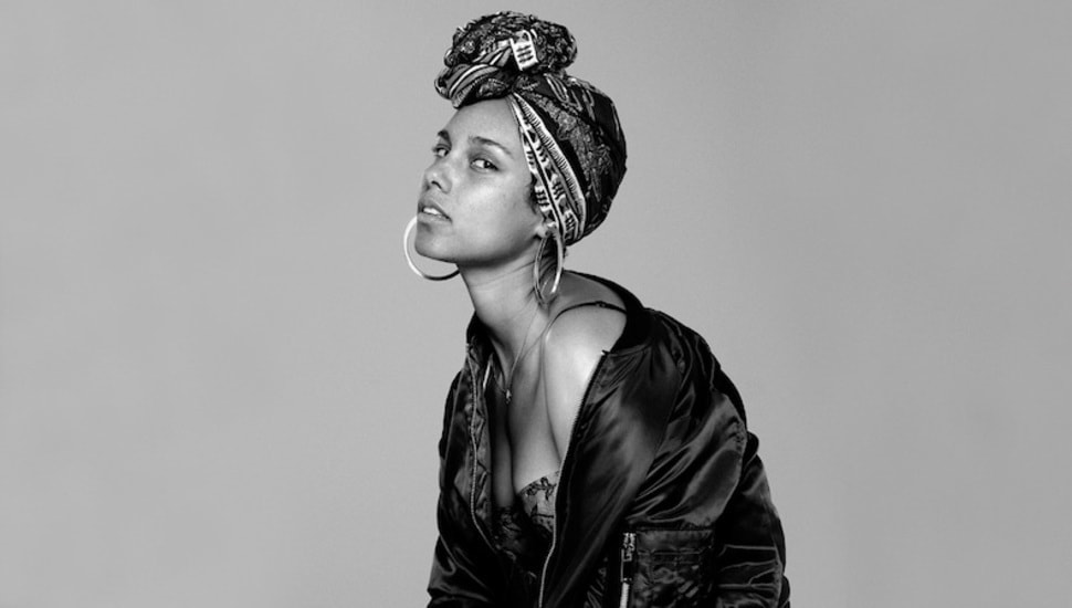
|
|
|
|
These kind of shots are used to promote an album cover, or to make a connection with their audience. it does seem to be quite common with R'n'B artists.
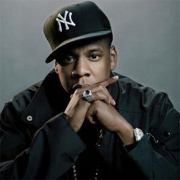
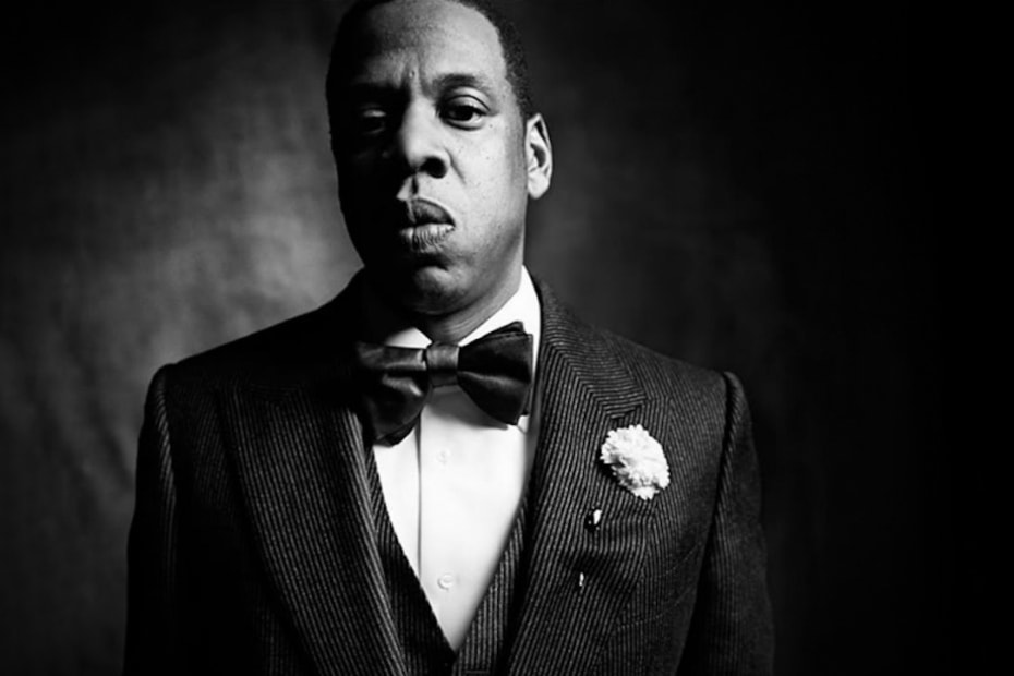
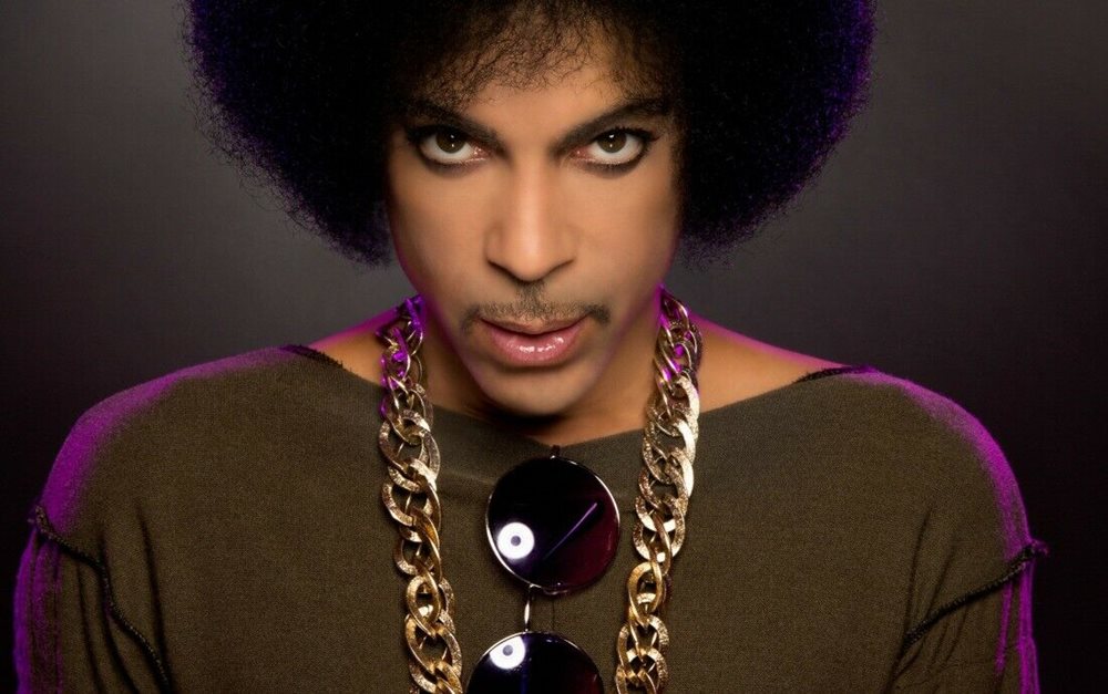
Chains
|
|
|
|
The chain fashion trend is usually found with the rapper in R'n'B, this is used to show status or to flash their chain to the public for clout.
Audience Profiling
For the audience profiling I created a persona, that caters directly to the target audience for my music magazine, I gave him a relatable background, interests and hobbies. I also speculated what kind of clothes would be warn by someone in my target audience.
|
Male Reader
Name: Devante Johnson
Age: 17 Background: African American Occupation: Student Likes: playing basketball, R’n’B, video games and Netflix films and shows. Dislikes: discrimination, snakes, spiders and crime |
|
|
Hobbies and Interests
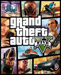
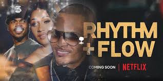
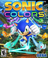
Devante plays Basketball in Compton on Saturdays, and watches NBA games live with his family, either at the game or at his home. He supports the Boston Celtics and dislikes the Chicago Bulls. He is quite passionate about computers and aspires to be a games developer after he finishes he’s education. Devante currently is attending TINT The Institute of Natural Talents. In his spare time he watches Netflix films he quite likes the film: game over man and enjoys the Netflix series rhythm and flow. He likes a range of video games from sonic the hedgehog to GTA V.
|
|
|
Clothing and Fashion
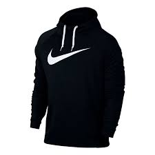
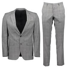
When it comes to fashion Devante likes Nike, the Everlast sports line as he uses these for exercise or just if he goes out with friends, he wears Jordan's and other casual sports ware. When it comes to special occasions he would wear more sophisticated clothing like Hugo Boss but for a regular occasion he would wear a shirt, jeans and suitable shoes.
|
|
Musical Interests
|
When it comes to music Devante loves R’n’B through R’n’B he was introduced to his favourite rappers and singing because the R’n’B genre is quite expansive and has a mix of some of the best rappers and singers. Devante’s favourite R’n’B artists are Lauryn Hill, Chris Brown, Jay Z and Khalid. He for some of these four artists he can relate to their music as they put a lot of emotion and meaning into the music they put out. He also likes how these people present themselves in the media, even though someone like Chris Brown has done some questionable things in the past but he didn’t let that stop him from doing extremely well. Devante in his spare time creates music himself where he raps and sings, he mirrors this genre but adds his own personality to the genre since he doesn’t want to be seen as copying someone else's work.
|
|
|
|
|
Female Reader
Name: Nevaeh Thompson
Age: 25 Background: Latino American Occupation: Working Mum Likes: Football, video games, R’n’B, movies, shows, shopping, dancing and acting. Dislikes: discrimination, snakes, extreme heats |
|
|
Hobbies and Interests
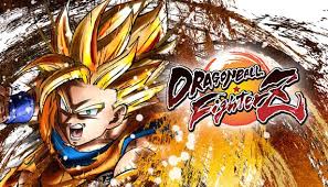
Nevaeh loves to play and watch football in her spare time. She supports Arsenal, but dislikes Man Utd. At university level she studied drama and theatre studies and music, she currently has an agent who has gotten her a steady roles in a comedy show called pleasant times. When she's not playing football or acting, she plays some competitive video games like COD, Fortnite, or Dragon Ball Fighterz with R’n’B music playing In the background to keep her calm. She also likes sopping hen ever she goes out but knows when to stop.
|
|
|
Clothing and Fashion
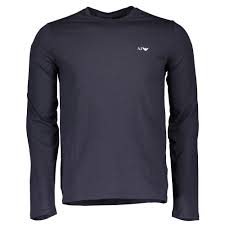
When it comes to fashion Nevaeh gets her clothes from places like fashion nova, misguided, prettylittlething, Nike and Armani. Fashion nova, misguided and prettylittlething provide her with casual clothing like jeans, shirts and dresses; but every now and then she switches it up and wears Nike sports ware like when she goes to play football or when she is just going out and its nothing special, and she wears Armani, or prettylittlething for special occasions.
|
|
Musical Interests
|
|
Nevaeh growing up listening to R’n’B and she is always listening to this genre to help calm her down or just for entertainment. She has a strong connection to R’n’B because she could always find a song that mirrors how she is feeling at the particular point in time. Her favourite artists are SZA, Kendrick Lamar, Aretha Franklin and Beyoncé. She grew up on Beyoncé and Aretha Franklin where they caused her to write her own song lyrics from a young age. SZA and Kendrick are just artists she is quite recently fond of.
|

|
|
|
Typography Board
|
|
|
|
Drawn Drafts
|
|
Front Cover Production Steps
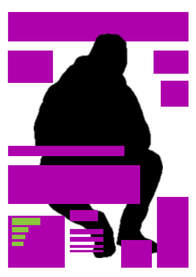
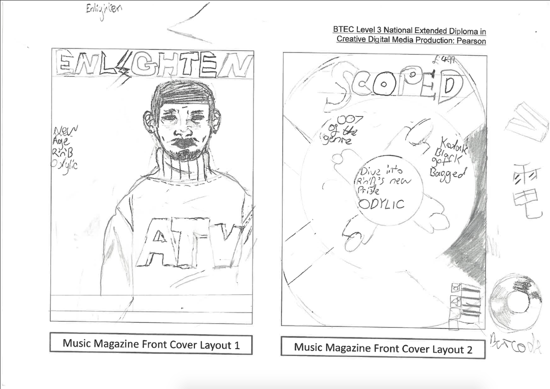
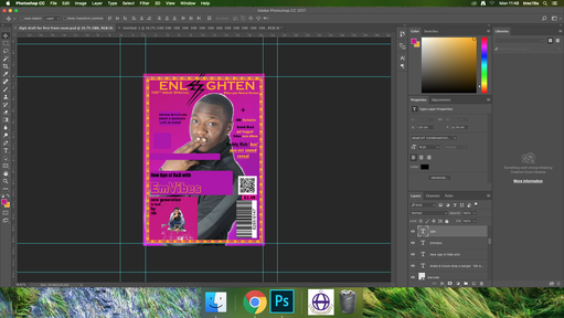
This is my digital draft this was the rough idea i had for my front cover.
|
Monday 20th January 2020
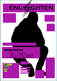
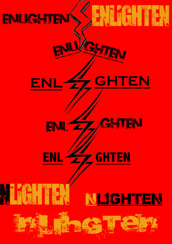
This is the progress I have made turning my digital draft into my real front cover. I during this lesson I was thinking of adding my main image first but I realised, that I need to crop out the background on the image so i thought that I would leave the main image out for now, so I instead decided to do as much of my typography as can. As you can see I finally came up with a suitable name for my artist which is Emvibes. I would say up to this point my ability to use Photoshop, has improved as I am able to use new fonts and start to construct my own magazine. for my Masthead I made sure that I got a lightning bolt image from the internet and I planned on centring the Masthead around it because I feel like the lightning bolt makes the Masthead seem more interesting. |
Tuesday 21st January 2020
So in this lesson as you can see I made more progress on the front cover, I have decided to put my main image on the page along with the double page spread artist, I added the double page artist because he is supposed to be quite big in the genre so I thought it only makes sense. I also added a small statement to go next to the double page artist so that the reader knows his name and shows him as important. |
|
Wednesday 22nd January 2020
So from this lesson i have adjusted the placement of my text box's to fit the trim and margins excepts for the lightning bolt logo in the middle because for now i think i want the margin to cut off the tip of it. I spent sometime trying to figure out how to cut out the background but after a while i got the idea to make a blend with the picture and the colour purple, to do this i created a new layer and changed it from normal to multiply. |
|
Thursday 23rd January 2020
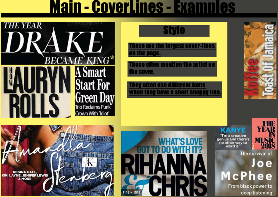
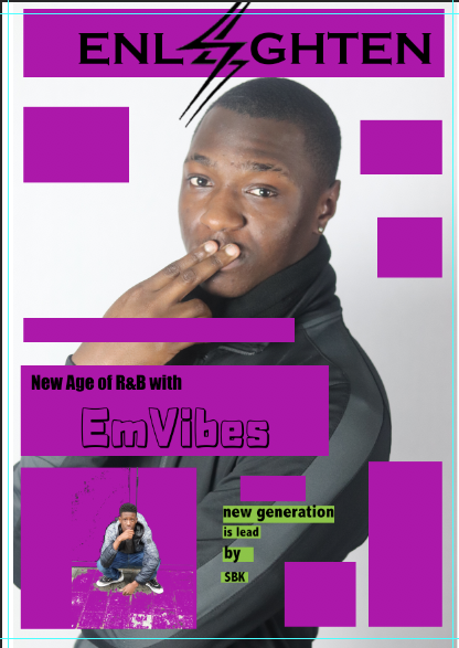
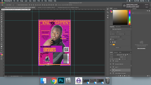
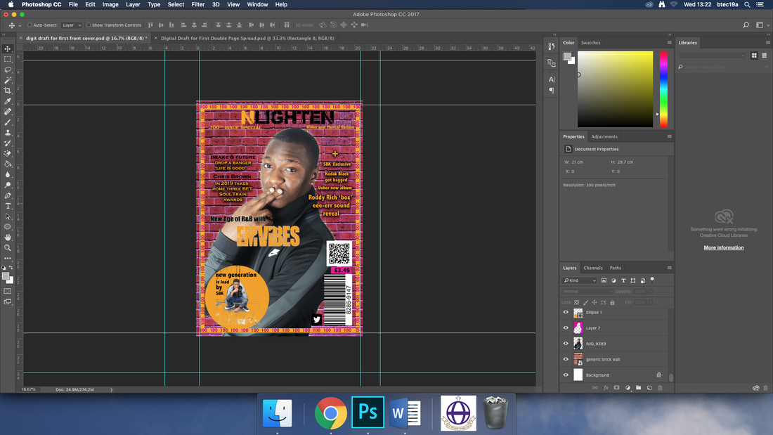
today I spent a lot of the lesson creating a white outline around my main image and I think it looks good and I decided to this because I thought it would give off an enlightenment kind of vibe and also because I think it looks nice. I have also added another cover line that mentions drake and futures new song and I even added the the 100th issue special part just above the main cover line, I think the front cover being at a milestone makes it more special. For the text I put it in gold to make it stand out, this is also the same reason for me changing the colour of the name of the main cover artist. |
|
.Friday 24th January 2020
Today decided to change the background colour to a brighter purple gradient and I think it turned out good, but for my to do this I had to re-outline my main image which took quite a while but I was able to finish at a fairly good time. I also added more cover lines and placed them in a different location (on the right side of the page),I also added my slogan which says "Widen Your Musical Horizon". When I look back on this session I think that the front cover looks really good but it could use something like a border to show that the front cover is on its 100th issue. |
|
Monday 27th January 2020
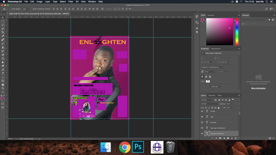
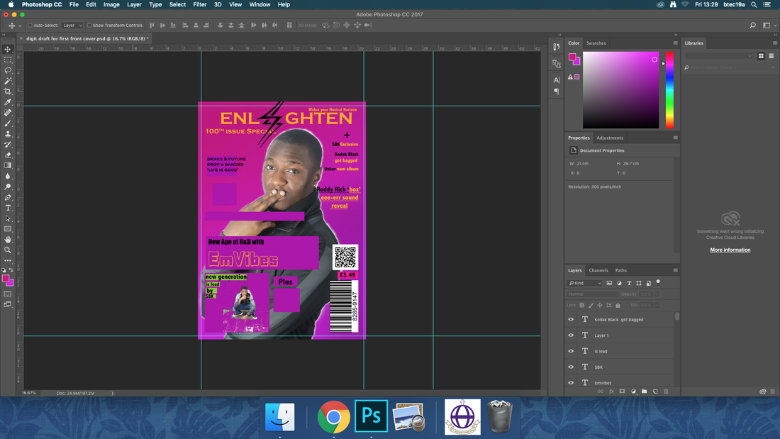
Today I decided to create a border for my front cover, for this border I took inspiration from a front cover called the source it was its 200th issue one with ice cube on the front cover, so when making it I kept in mind my main colour scheme which is purple, gold and black, I made this because I want it to be obvious to the reader that the magazine is at its 100th issue and I thought that it would be nice to include that kind of thing. During the creation of the border I learnt a faster way of typing that all out which was to copy and paste then create appropriate spaces for it. When I look back on my colour scheme I feel like i'm starting to question the colours I have chosen and i think i may start to re-think my colour choices. |
|
Tuesday 28th January 2020
Today I decided to finish off my cover lines and extra artists featured and their placements, I decided to change the artist names colour to gold and the info to black, I did this to catch the readers eye, I also changed the font used for my main artist on the front cover from Rabanera to abandoN I did this because the Rabanera font is harder to see on the page and it is meant to stand out to show off the artist. In this lesson I challenged myself to be able to identify if certain elements on my page look out of place and I was able to tell that my Masthead doesn't exactly capture the style i'm looking for so this should hopefully be changed in a future log. if I look over everything i have done so far this lesson I would say that i have made good progress with my work and i like my magazine. |
|
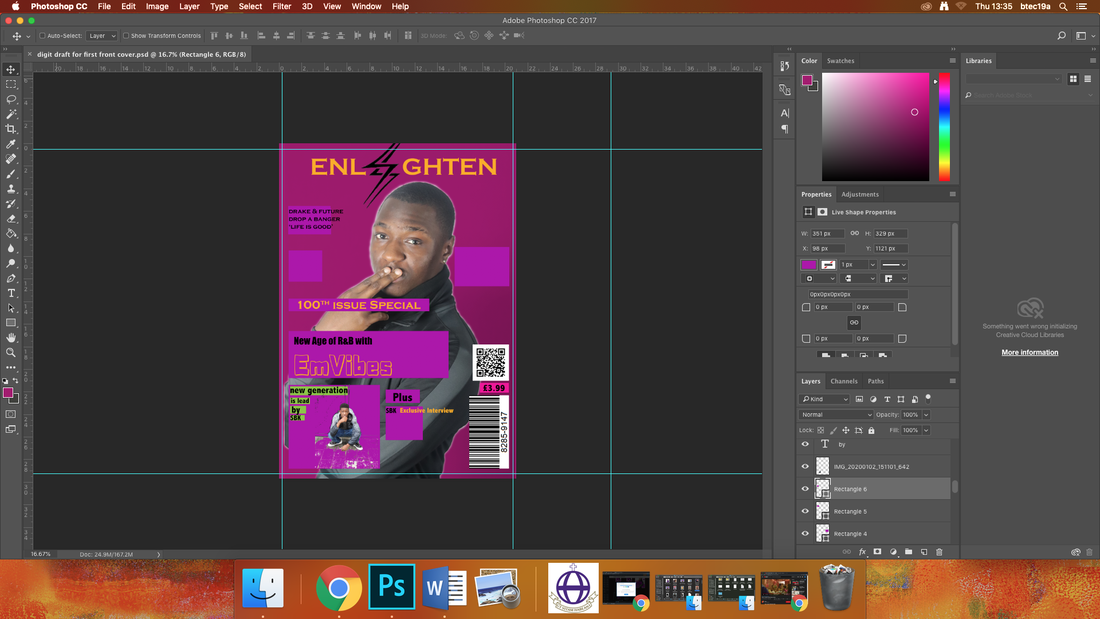
Wednesday 12th February 2020
Today I made many changes to my front cover i would say that my front cover is nearly at its final stage, i changed the opacity of the purple gradient from 100% to 50%. I also added drop shadows to the text so it can be more visible, and personally I think it looks very good I also had to re-learn how to cut out the background on the twitter logo and for that i used Microsoft office word and click on remove background. I changed the rectangle with my double page article artist in it to a circle, I did this because I feel like it looks more presentable and doesn't take the attention off the main artist on the front cover. I changed the brightness of the main image by going to image, then adjustments, and then I went to brightness and contrast, when i got here I raised the contrast, (and brightness but just by a bit) then I dropped the saturation to make the colours of his clothes look more present. When I look at what I was able to accomplish this session, I was happy mainly because I managed to get past my 'creative block' |
Final Evaluation
I got my model to pose in this manner to show a level of arrogance, but humility at the same time, I feel this seems to be the usual look an R&B or Hip-Hop artist would go for and I think that this is a good look, for my artist it gives off a tone that suggests higher status. The style I chose was inspired off the many poses you see artists do in their photoshoots, I even did research into the genre specific poses and costumes (like hand poses, side on shots, big curly hair, waves and even black and white shots), so I chose this particular style because I feel like it conveys the correct amount personality from the artist. The lighting of the picture originally wasn’t the best because the originally the image looked kind of grey which wasn’t great so I decided to up the brightness and contrast along with the saturation, I did this because I really disliked the grey tone of the image and after I did this you could really see the black and grey on his clothing and his skin colour was better represented after the change as well, so I would say that I made this decision was done to make each colour in the image stand out and really be visible, during this shoot there were no props used mainly for the fact that I thought that they weren’t needed, when it comes to the costume I wanted him to dress casual so that it could be relatable to the target audience as they would see an artist wearing casual clothing that anyone could get, he is also wearing ear rings and I think it was a smart creative choice as males wearing ear rings are becoming a lot more common and I think many people in the target audience could go for a look like this. I feel like this could create a link between target audience and my artist. If I could change anything about how I used mise-en-scene in this front cover, I would say that I would change the pose he is in or have him wearing something else just for the fact that I feel like the black neck warmer doesn’t look that good (but for this it works) and get him to wear a ring since that is a common costume item for an R&B artist to have. For the background colour I made it a gradient of purple that leans more toward pink and I chose this because I wanted my magazine’s main colour to represent the name of the magazine which is enlighten, so I did research and I learnt that the colour purple connotes enlightenment so I decided to use that as my main colour in my colour scheme and for what it’s worth I feel like it turned out well, but if I never chose to name it Nlighten I think my whole thought process and creative direction would have gone in a completely different direction like I was thinking about making the main colour scheme black and grey, then I would have grey scaled the image to play into that kind of tone of a serious artist.
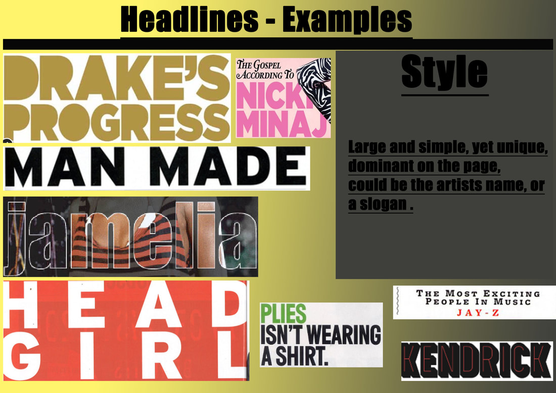
I used five fonts in my front cover I used impact for most text on the page I did this because this font is very well balanced and is very similar to other font so it can give off the same vibe as other fonts, I used the cover-lines on the right are abadi MT condensed extra bold, I chose this because I felt like this was a good font to have for the cover-lines as it is bold and looks aesthetically pleasing, the main feature cover-lines are copperplate gothic bold, I used a different font so that I could make it clear who the big named featured artists are and I know that this would get more readers because I have used very well known artists to be featured on this front cover and I used AbandoN for my artist’s name, I mainly did this do that his name would stand out the most and look different from all the other names.
In my front cover I made sure I included all of the conventions that are seem in print magazines like the barcode, Main cover-line, Main image ,Masthead and the cover-lines. I feel like I probably should have made my Masthead bigger so that it can be easily recognisable, for like if it goes on a shelf it would be more easily distinguishable from other magazines, if I could re do my cover-lines I would want them to mention more famous figures from the R&B genre to draw in more people and I would want them to aesthetically look better than they currently do, this is because at the moment I feel like the font used is kind of bland and uninspiring.
|
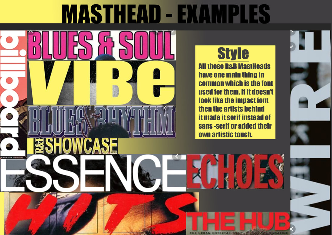
These are my MastHead ideas, I went through choosing out of these when I found the font website Dafont and on this website i was able to find what fonts i liked and and i found these fonts; urban jungle, rabanera, bronx bystreet, AbandoN and a dripping marker.
At first I really wanted to have a lightning bolt be a part of my mast head but over time i noticed that the lightning bolt doesn't really fit the general aesthetic i am aiming for. |
Double Page Spread Production process
|
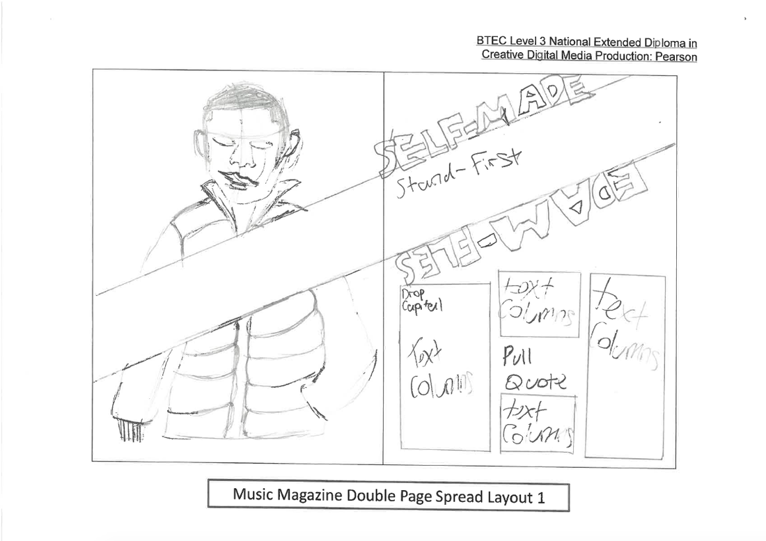
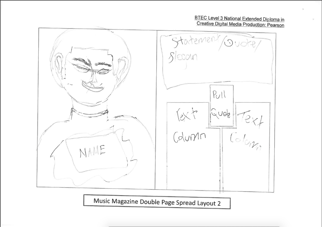
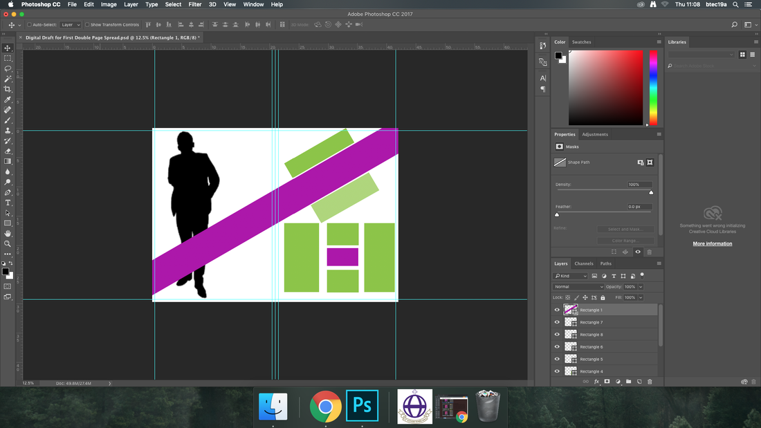
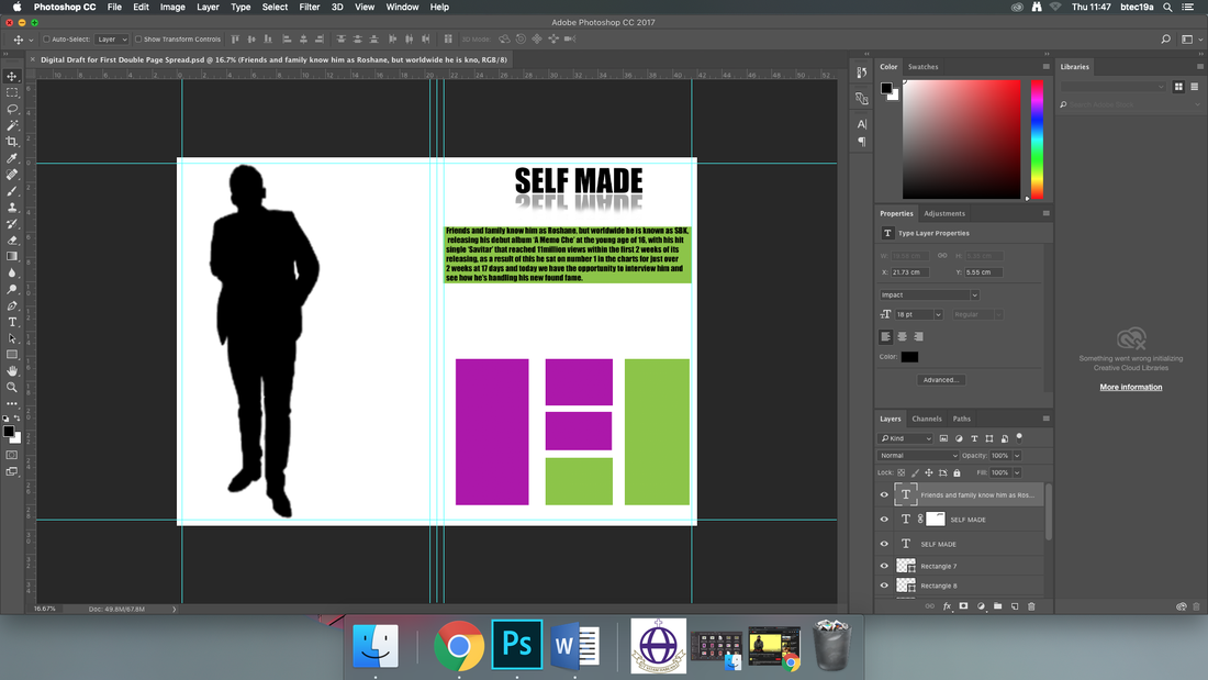
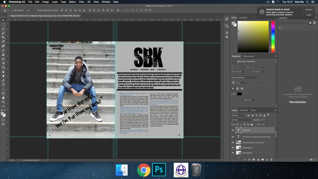
This is my digital draft for the double page spread, this is my original and favourite idea for the double pages.
|
|
Thursday 30th January 2020
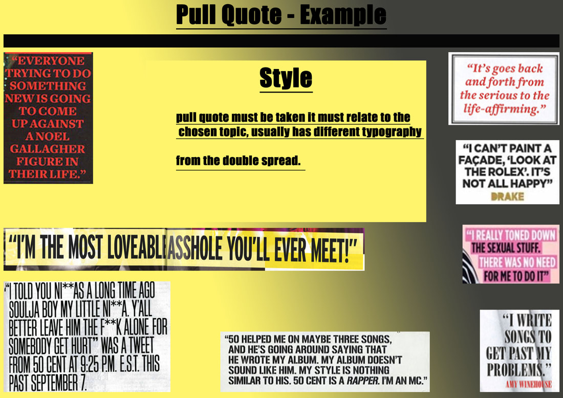
Today I created my headline and I wanted it to say 'SELF MADE' and I learnt how to give it a reflection, by watching a youtube video where I had to duplicate the text and vertically flip it and lower the opacity to 50% to give it a faded look, then I created a new layer mask and erased some of the faded text to make the look better. I did this because I thought it was a cool idea and it turned out really well. I also added my stand first it goes into some detail about my artists album. If there is something I could add before next lesson would be my pull quote. |
|
Tuesday 4th February 2020
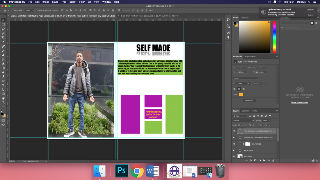
Today I added my pull quote and main image, in this session I chose get my pull quote from the lyrics of a song, which was location by Dave Ft. Burna boy. I did this because I felt like the bar describes how my artist sees himself personally i am starting to think about changing my whole colour scheme to fit with the picture on the page, I feel like this would be a good choice because as my double page spread is now it looks quite boring and bland and I want my double page spread to be unique, so I may use the colour of his shirt as the background colour. Looking back at this session it would've been better if I got all my text on the page first before deciding on a colour scheme. |
|
Wednesday 5th February 2020
Today I finally added all my typography and I will be adding my drop capital next lesson, I made the background colour grey because I wanted the colour silver as it has the connotations of modernity, which relates to my artist as he is from a younger generation of R & B artists. I chose the colour denim blue for the questions because it is the same colour as the jeans my artist is wearing and the colour connotes rebellion, freedom and youth. when looking back on this session I have made a lot of progress with my double page article but I still don't know where to place my pull quote. |
|
Thursday 6th February 2020
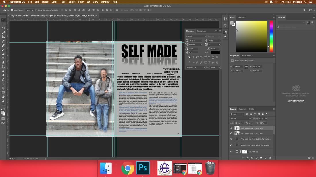
Today I moved around the placement of my stand first because the page had too much blank space and I thought that did not look nice. I also learnt how to add faint images onto the page and i want to add one more of my subject in a different position i want to do this because I think it adds personality to the artist and it also conveys the attitudes RnB artists may have, so I will be adding another image next session. When I look back on the changes I made this session I think that the typography placement changes were for the better but I am still not sure about my decision to add the faded images , but we will see what it turns out like. I didn't add my drop capital because I thought I should sort out everything on the page first because it is one of the simplest tasks. |
|
Tuesday 11th February 2020
Today i made many changes to my double page spread, I change the Headline to SBK (the name of my artist) from Self Made I did this because i felt like the Headline Self Made was quite dull and boring to I opted to change it to SBK since I wanted to make his name stand out. I got rid of the illusive double of the artist because I felt like it didn't fit into the general aesthetic I am trying to create. |
Final Evaluation
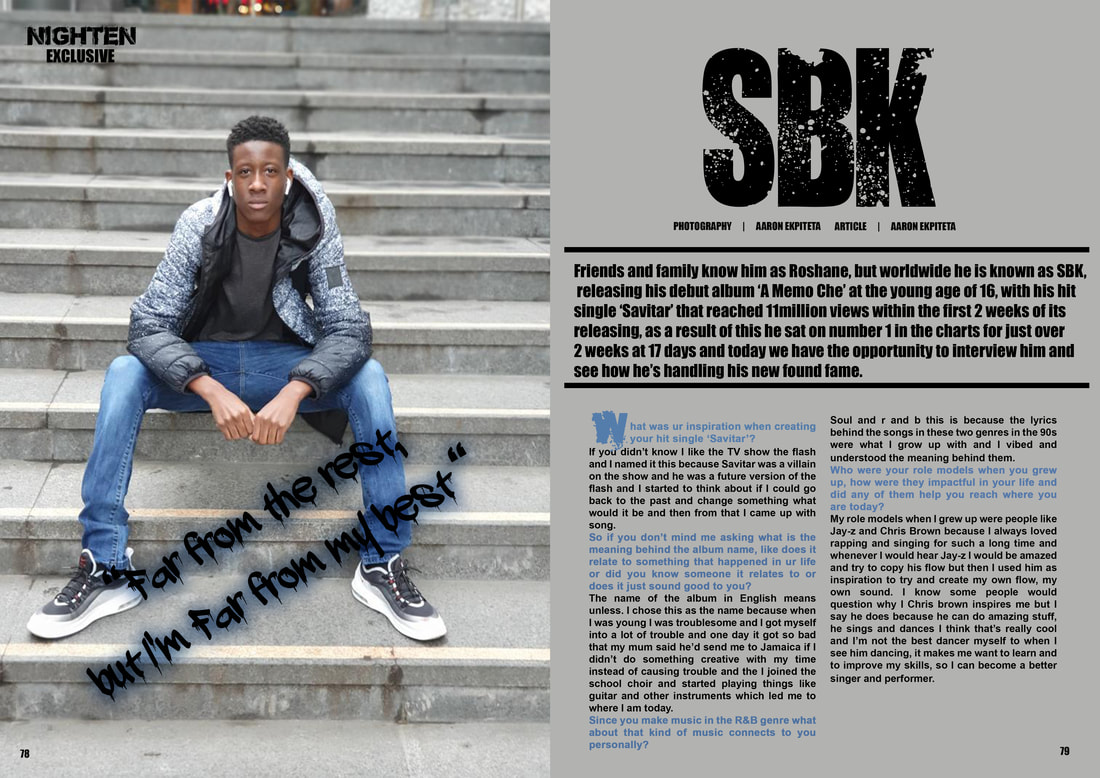
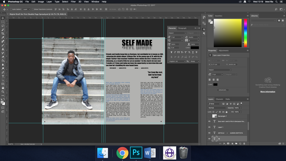
For this double page spread I got my friend to model in this picture and I told him to pose like this so his NVC would show a more serious expression but have an arrogant kind of look to him, I chose this setting because I wanted him to be a debut artist who has some humility and remembers his upbringing, I chose to make him like this because a lot of R&B artists or Hip-Hop artists are very arrogant and let the fame get to their head so I decided to still use some of these character traits but, to have him be more humble. For the lighting in this image I used natural lighting as we took the photos in a bright location where there wasn’t too much shade to throw off the lighting. The only prop used in this image is the air pods in his ear during the photoshoot, we actually forgot to have him take them off but after looking back on the photo I think that the air pods link to the target audience with how air pods are an item that many people like and doesn’t make my artist a trend setter but, it makes him more of an influencer. For costume I decided to go with a casual look again because I thought that with how I wanted, him to be presented casual clothing shows this in the best light.
For my typography I used the same fonts as in the front cover, I used AbandoN as the font for my artists name in this double page spread, I chose this simply for the fact that I do genuinely like the look of it and it promotes a younger generation. For my pull quote I chose the words “Far from the rest, but I’m far from my best” I chose this quote because I actual heard this line in one of my favourite song location-Dave Ft. Burna Boy, and I have heard my friend say this before and I felt like it captured the humility, in an artist that I was looking for so I decided to use it, those are the words of someone who knows where they are and respects those who help get him there. I also used the font Bronx bystreets for my little nlighten exclusive bit in the top left hand corner I chose this font because I used it for my masthead and it wouldn’t make sense to change it here.
stand first I talked about my artists debut album, and I made sure it would be noticed by placing line above and below it and making the text a slightly bigger size and making it bold. For the colour scheme I went with grey black and blue I chose this colour scheme because I felt like these colour are reflected by the image and work really well together, in my opinion I would say that the colour choice works well and bridges the image and article together.
